Mobile App / Interactive Media
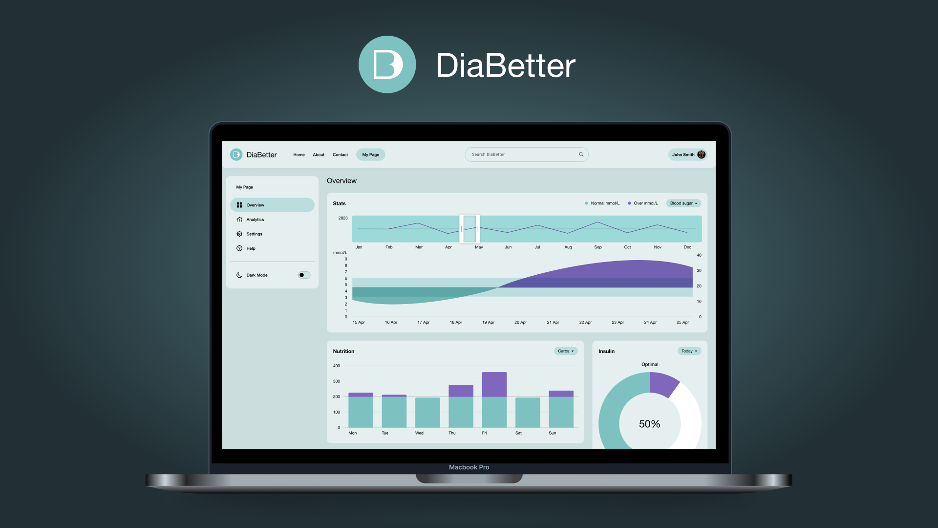
DiaBetter - Diabetes prevention app dashboard
The prevalence of type 2 diabetes is increasing globally, and early detection and intervention can help prevent the development of this disease. A diabetes-risk web dashboard can be a useful tool for assessing an individual's risk of developing type 2 diabetes and providing personalised recommendations for reducing that risk.
Role:
UX/UI
Research
Team:
Jovana Solunovic-Mitrovic
Timeline:
January 2023
The purpose of this UX project is to design a diabetes-risk web dashboard that is user-friendly, intuitive, and effective in communicating an individual's risk of developing type 2 diabetes. This dashboard will be designed to take into account various factors such as age, weight, physical activity, family history, blood pressure, and ethnicity to provide an accurate assessment of an individual's risk.
Competitive research
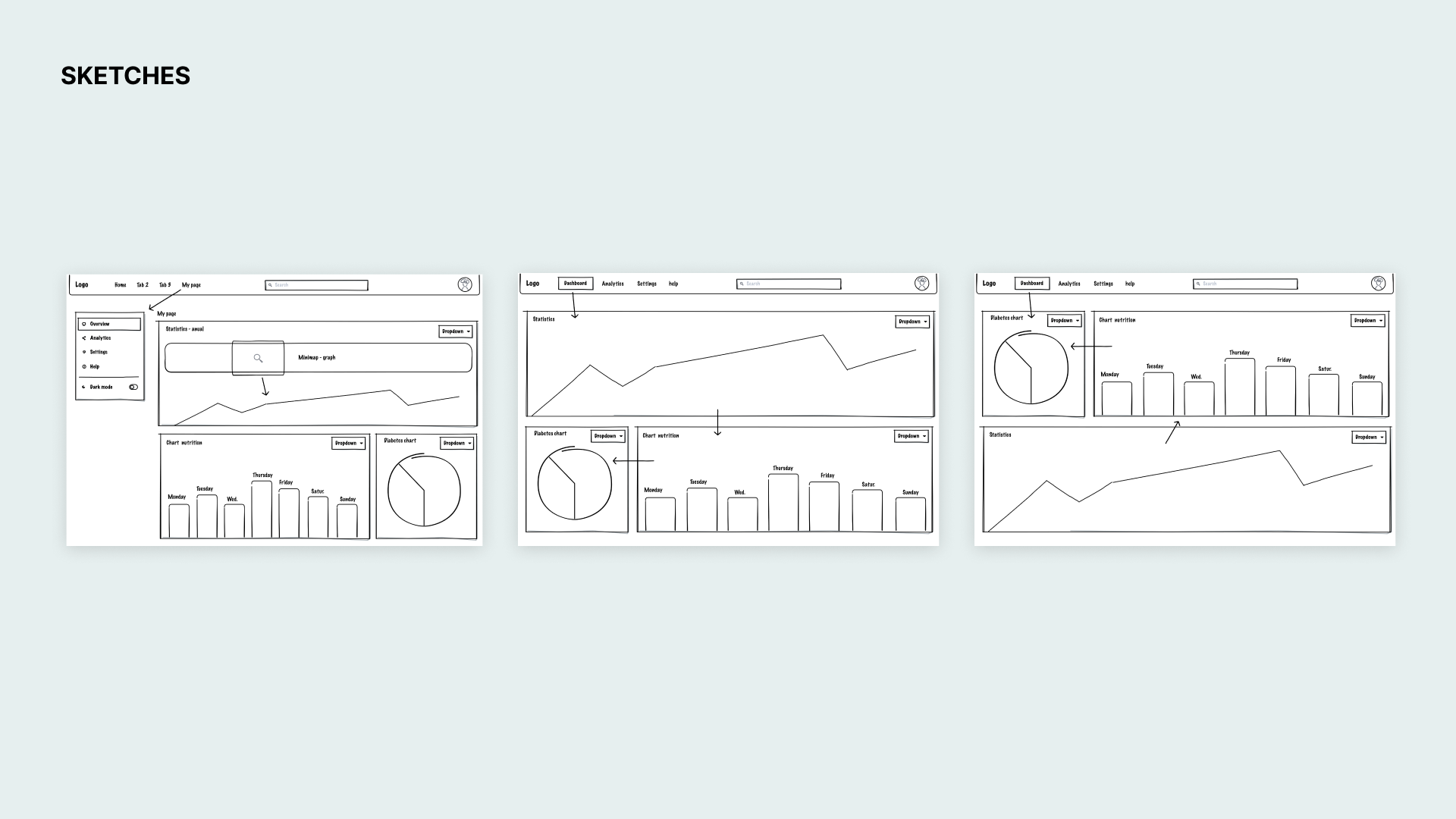
By reviewing and analysing these examples, designer can gain insights into how to design a diabetes-risk web dashboard that effectively communicates risk and provides actionable recommendations for reducing risk.
- Diabetes UK's Know Your Risk tool: Similar to the ADA's tool, this online assessment takes into account factors such as age, gender, ethnicity, weight, and family history to determine an individual's risk of developing type 2 diabetes. The dashboard displays a risk score and provides recommendations for reducing risk.
- My Diabetes Coach: This web dashboard is designed to help people with diabetes manage their condition. It includes features such as a food diary, blood sugar tracker, medication tracker, and exercise tracker. The dashboard displays data in easy-to-read charts and provides personalised recommendations for managing diabetes.
- GlucoseZone: This web dashboard is designed for people with diabetes who want to improve their fitness levels. It includes customised workout plans, video tutorials, and progress tracking tools. The dashboard displays data in easy-to-read charts and provides personalised recommendations for improving fitness and managing diabetes.
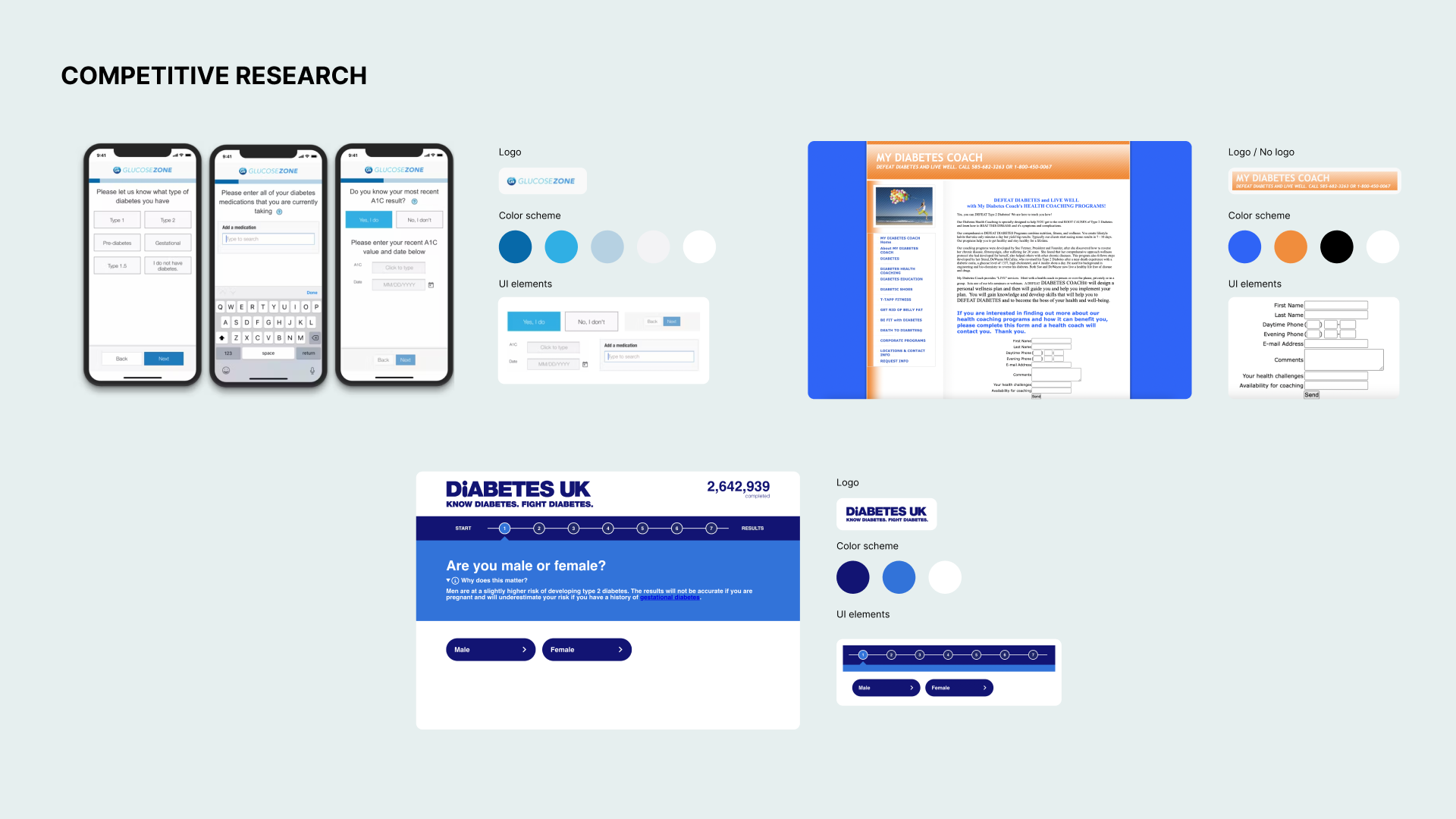
This UX project will follow an iterative design process. The goal is to create a diabetes-risk web dashboard that effectively communicates an individual's risk of developing type 2 diabetes and encourages behaviour change to reduce that risk.
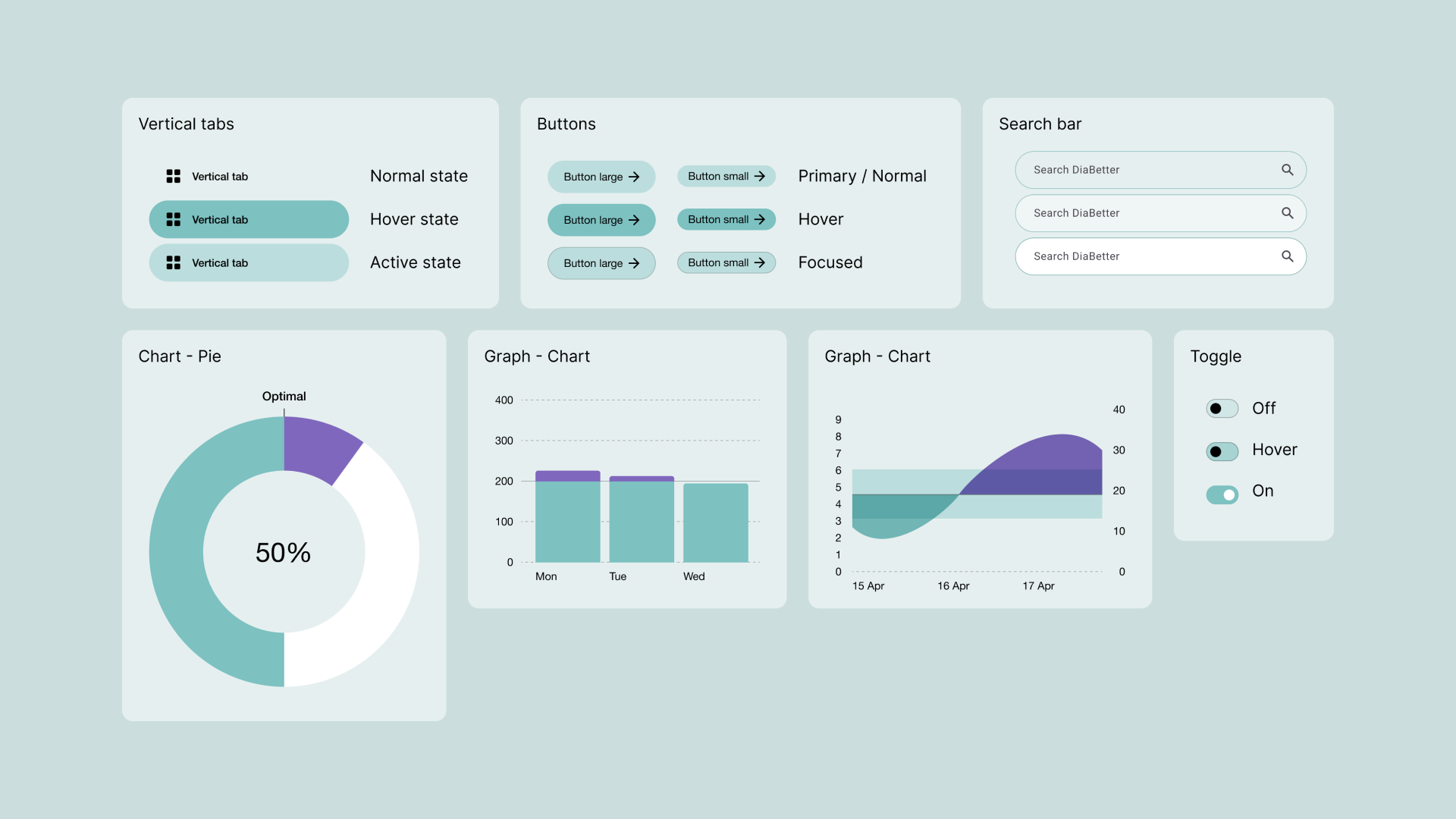
Designing a diabetes-risk web dashboard requires careful consideration of various factors, including user needs, data accuracy, and visual design. Throughout the project, I have learned that the dashboard must be visually appealing, easy to navigate, and intuitive to use. Also, designing a diabetes-risk web dashboard is an iterative process that requires constant feedback and improvement based on user testing and data analysis.
Next steps
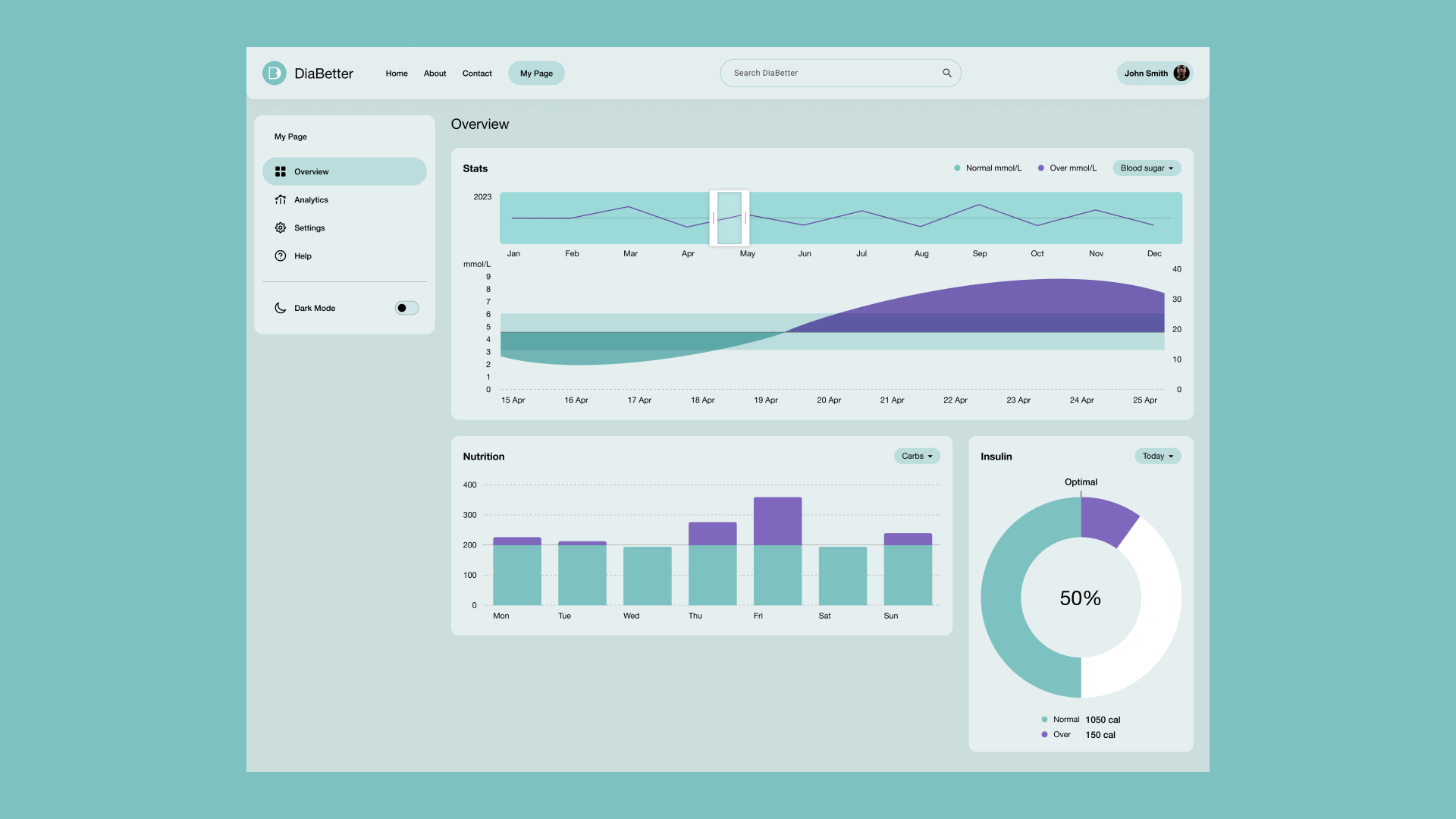
A diabetes-risk web dashboard should have a user-friendly and intuitive design that allows users to easily assess their risk of developing type 2 diabetes and provides personalised recommendations for reducing risk.
The dashboard should take into account predefined parameters such as age, weight, physical activity, family history, blood pressure, and ethnicity to accurately assess risk. It should also display the risk score in a clear and concise manner and provide explanations on what the score means.
In addition, the dashboard should provide users with actionable recommendations for reducing their risk, such as diet and exercise tips, and display progress tracking tools to help users monitor their progress towards reducing their risk.
The user experience should be optimised for mobile devices, in the future iterations, as users may want to access the dashboard on the go. The dashboard should be visually appealing, easy to navigate, and provide clear instructions on how to use it. Lastly, the dashboard should prioritise user privacy and security, with appropriate data protection measures in place to ensure user data is kept confidential and secure.
Designing a diabetes-risk web dashboard requires careful consideration of various factors, including user needs, data accuracy, and visual design. Throughout the project, I have learned that the dashboard must be visually appealing, easy to navigate, and intuitive to use. Also, designing a diabetes-risk web dashboard is an iterative process that requires constant feedback and improvement based on user testing and data analysis.
Overall, designing a diabetes-risk web dashboard requires a multidisciplinary approach that takes into account user needs, data accuracy, and visual design to create an engaging and effective tool for reducing the risk of developing type 2 diabetes.
