Mobile App / Interactive Media
GoRemote - An app for digital nomads
The rise of the digital economy and technological advancements has enabled a new generation of professionals to work remotely from anywhere in the world. These individuals are known as digital nomads, and they have the freedom to work on their terms without the constraints of a traditional office job. The digital nomad lifestyle has become increasingly popular, and it's estimated that by 2025, the number of digital nomads worldwide will exceed one billion.
Role:
UX/UI
Research
Strategy
User testing
Team:
Jovana Solunovic-Mitrovic
Timeline:
May 2023
The aim of this project is to design a user-centered digital platform that caters to the needs of digital nomads looking for work opportunities. Digital nomads are individuals who work remotely using their laptops and the internet and are not dependent on a particular location. These individuals work on a project basis rather than full-time and permanent positions, and they work in various fields such as writing, designing, or video editing.
The digital platform has a user-friendly interface that provides easy access to job postings from various fields. The platform allows digital nomads to create profiles that showcase their skills, experience, and availability. The platform also enables communication between potential employers and digital nomads.
The project's success will be measured by the number of digital nomads who use the platform, the number of job postings, the user's satisfaction, and the ability to match digital nomads with job opportunities that align with their skills and interests.
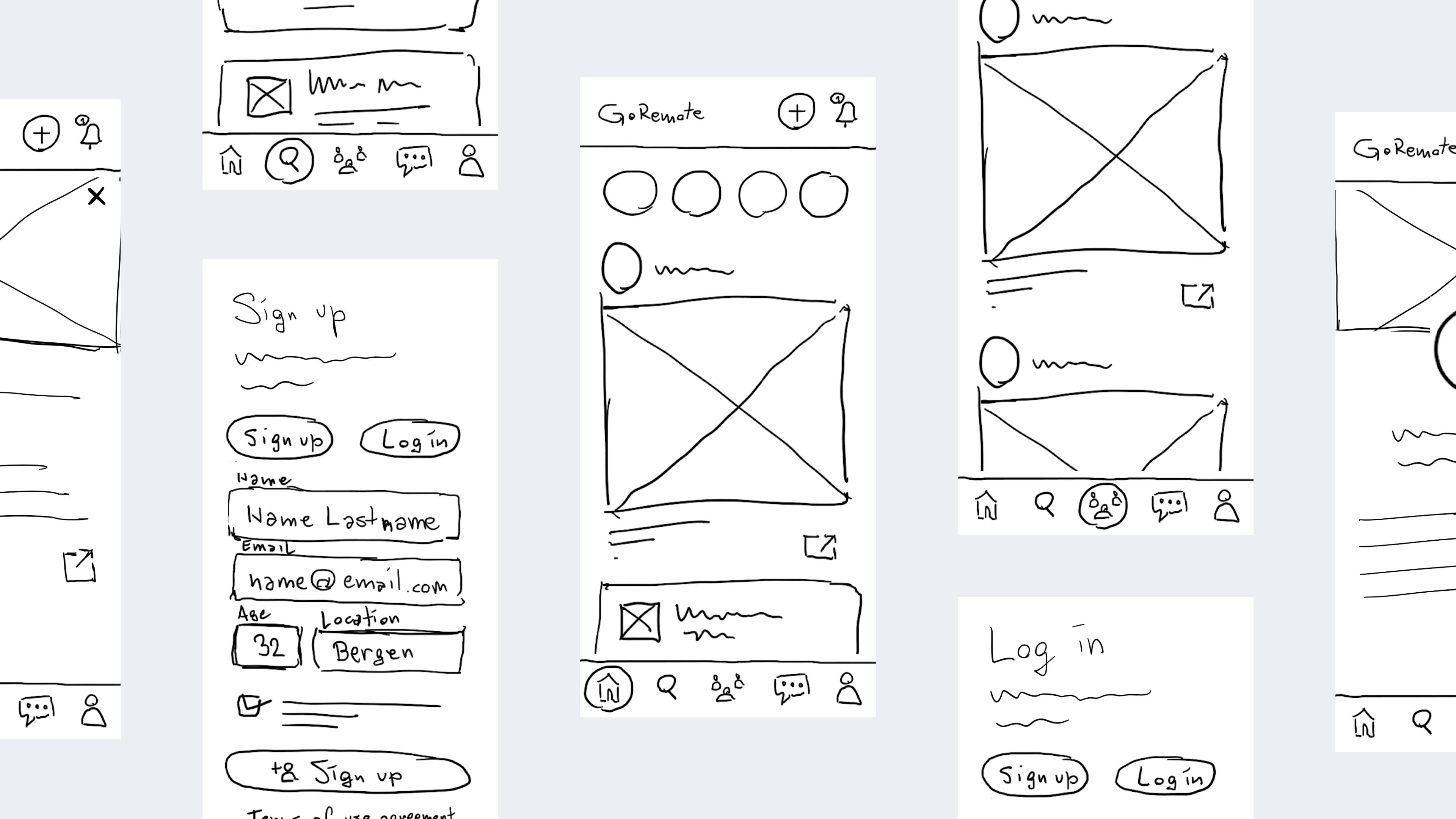
The chosen solution is summed up with the best elements of the top three ideas.
The GoRemote Mobile Phone App is the top solution for the the following reasons:
Social aspect - Remote work can be isolating and can negatively impact mental health. A virtual co-working platform can provide a sense of community and social interaction that can combat this issue.
Encourages productivity - Working from home can be distracting, and a virtual co-working platform can help provide a structured work environment that encourages productivity and focus.
Collaboration and networking - A virtual co-working platform can provide remote workers with opportunities for collaboration and networking with other professionals in their field, which can lead to potential partnerships, job opportunities, or business growth.
Potential for customisation - Depending on the platform, remote workers may be able to customise their virtual workspace to fit their specific work needs and preferences.
Accessible - A virtual co-working platform can be accessed from anywhere with an internet connection, making it an option for remote workers regardless of location.
Potential cost savings - Depending on the platform, a virtual co-working space may be more affordable than traditional co-working spaces or renting a physical office space.
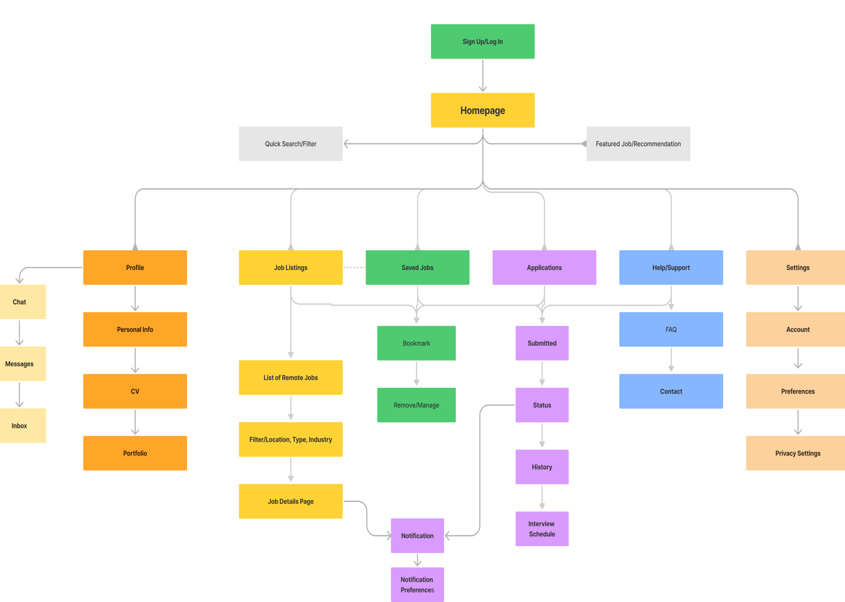
Applying UX flows in the designing process leads to a better experience for the user.
We can find a few types of UX flows: user flows, task flows, wire flows.
I will present the user’s path to finish a specific work or action through diagrams.
For this assignment, we have prepared a user flow and task flow.
The user flow diagram illustrates how users interact with the product through navigation.
The task flow diagram illustrates the navigation process of the user when performing a specific task.
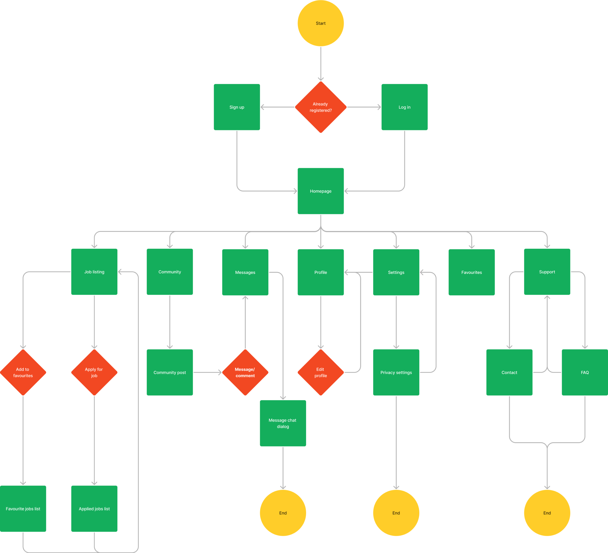
User should use the sign up dialog to create the account and browse through the app to find relevant job listings. User should start the application process for that job. Afterwards, user should find the functionality within the app to save these jobs


Usability testing Lo-Fi
The usability testing phase for GoRemote, a remote job platform designed to connect digital nomads and remote workers with job opportunities worldwide. In this usability testing, I will be focusing on the Lo-fi UX solution of the GoRemote mobile app. The purpose of this testing is to evaluate the initial design and functionality of the app, gathering valuable insights to refine and improve the user experience.
During this testing phase, I will assess how users interact with the Lo-fi UX solution of GoRemote, identify any usability issues or pain points, and gather feedback to inform further design iterations. By conducting this usability testing, I aim to ensure that GoRemote provides a seamless and intuitive user experience, ultimately enabling remote workers to easily find and apply for job opportunities while enjoying a positive and efficient platform experience.
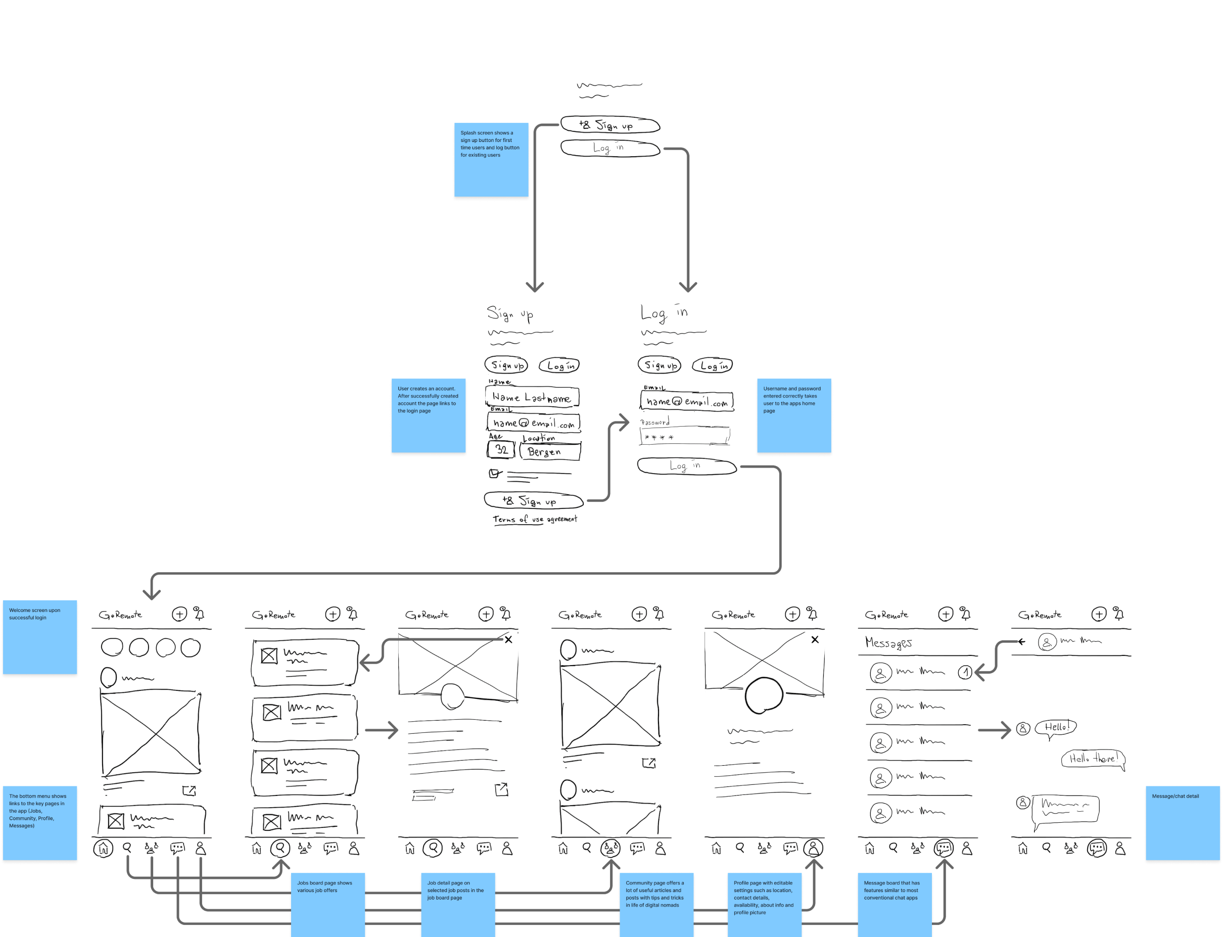
The low-fidelity usability testing revealed some areas of improvement for the prototype. The test results provide valuable insights into the usability of the low-fidelity prototype, guiding further iterations and improvements. The findings will inform the refinement of the user interface and interaction design to create a more intuitive and seamless user experience for the remote job platform.
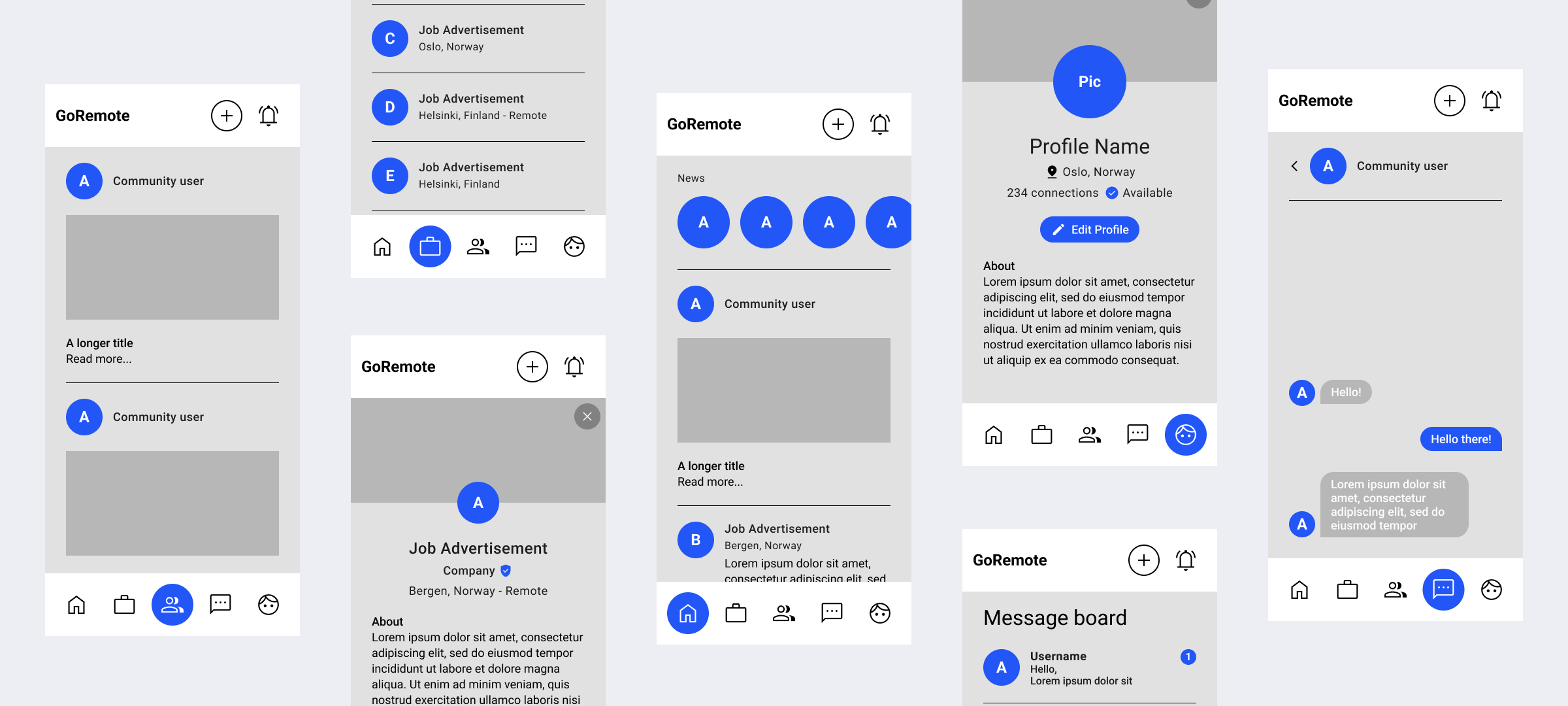
UI and High-Fidelity Prototype
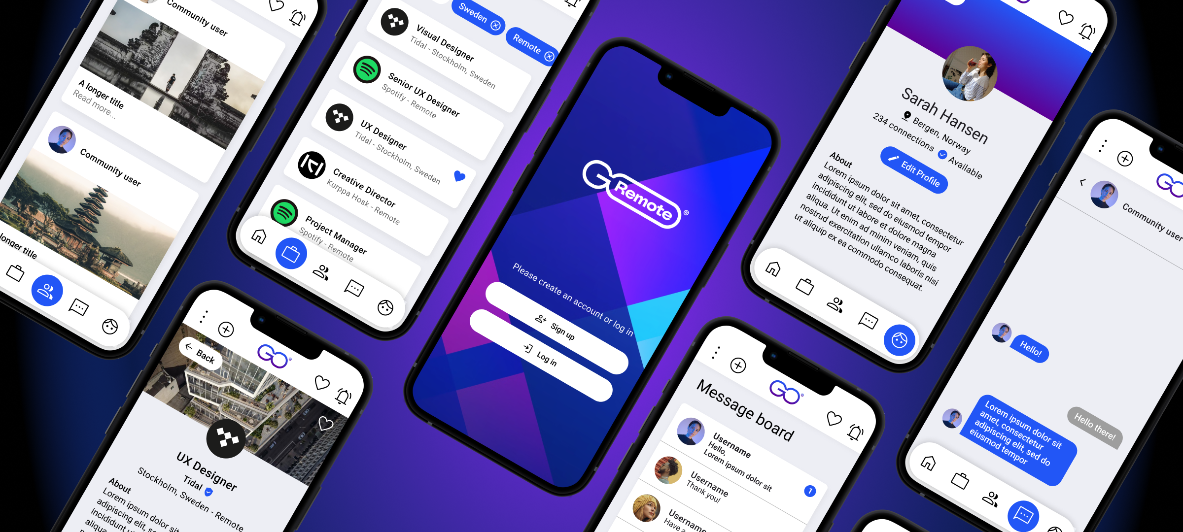
The UI solution for GoRemote focuses on creating a visually appealing and intuitive interface that enhances the user experience. It incorporates a clean and modern design, with clear navigation and intuitive interactions to ensure ease of use. The UI elements are carefully crafted to align with the branding and create a cohesive visual identity. With a user-centered approach, the UI solution aims to provide a seamless and engaging experience for users as they explore and interact with the GoRemote platform.
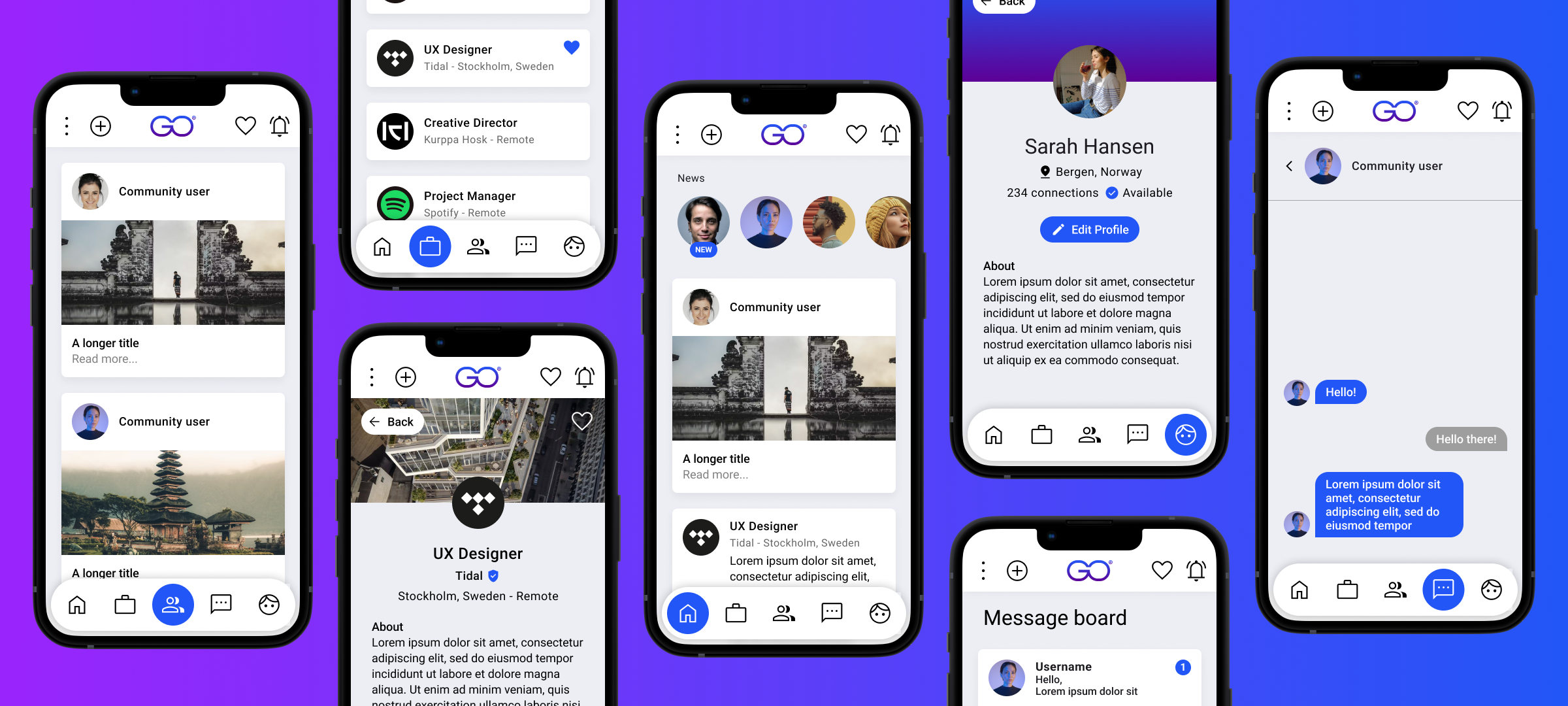
Usability testing High-Fidelity
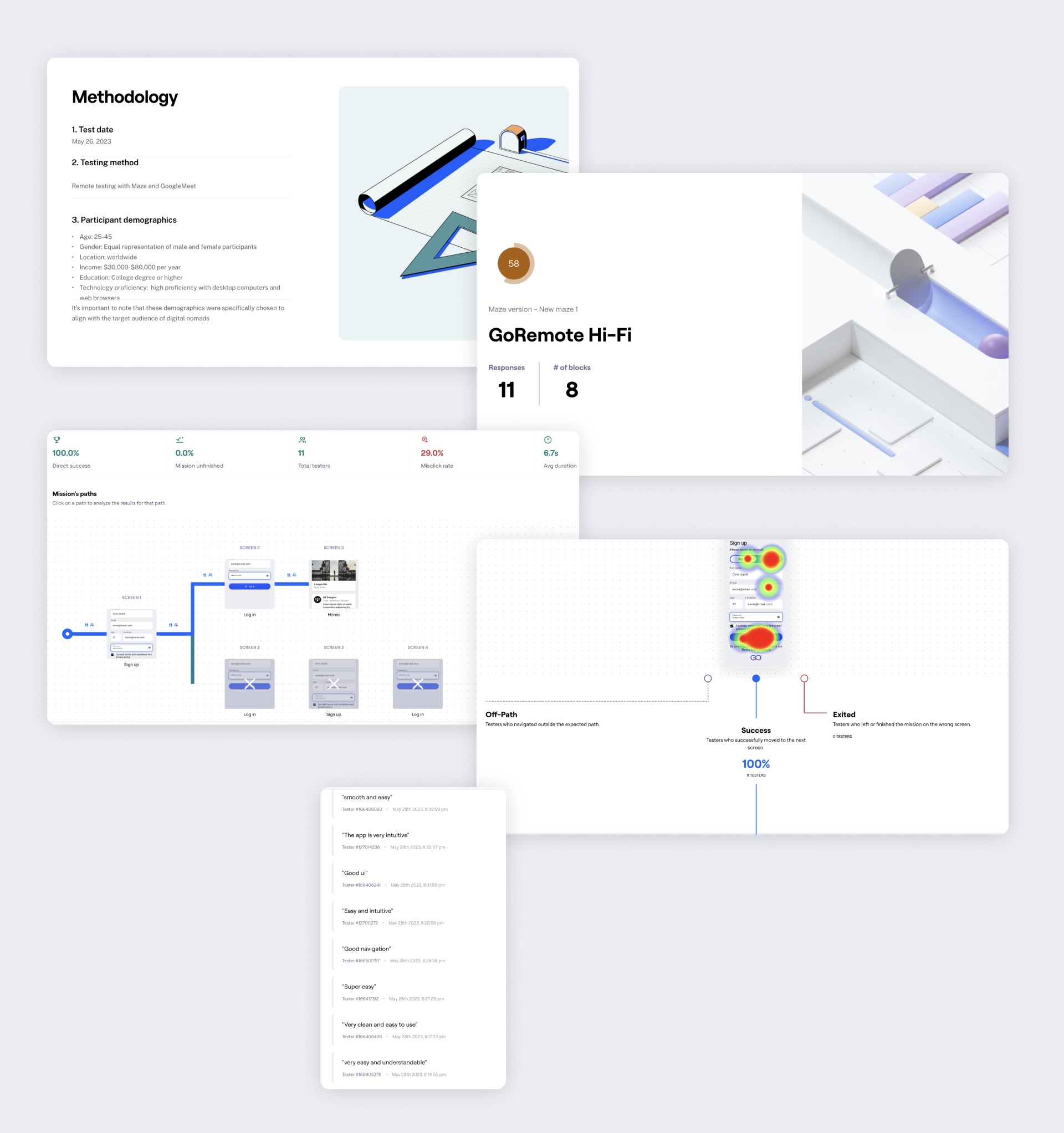
GoRemote is a mobile app designed to provide a comprehensive remote job platform for users. It aims to connect remote workers with job opportunities and facilitate seamless job searching, application submission, and profile management. The usability of the app was tested with a group of 8 participants, and the following key findings were observed:
- Task Completion: All participants were able to successfully complete all assigned tasks, indicating that the app's functionalities were intuitive and easy to navigate.
Misclick Rate: The misclick rate was observed to be 34.2%, suggesting that some users may have encountered challenges in accurately tapping on certain elements or buttons within the app. - Task Duration: The average time taken to complete a task was recorded as 41.3 seconds, indicating efficient navigation and task execution within the app.
- Success Rate: The average success rate across all tasks was 12.5%, suggesting that participants were able to achieve their intended goals within the app successfully.
- Bounce Rate: The app experienced a bounce rate of 25%, indicating that a portion of users abandoned or left the task before completion. It was found that users with upgraded iOS systems faced technical issues, such as extended loading times or inability to open certain pages.
- User Familiarity: None of the participants had prior experience using a similar app, highlighting the uniqueness of GoRemote in the market.
- User Expectations: Two out of eight participants expressed the expectation of receiving notifications after performing an action or submitting an application within the app.
- User Feedback: Six out of eight participants stated that the app was easy to use and served its intended purpose effectively.
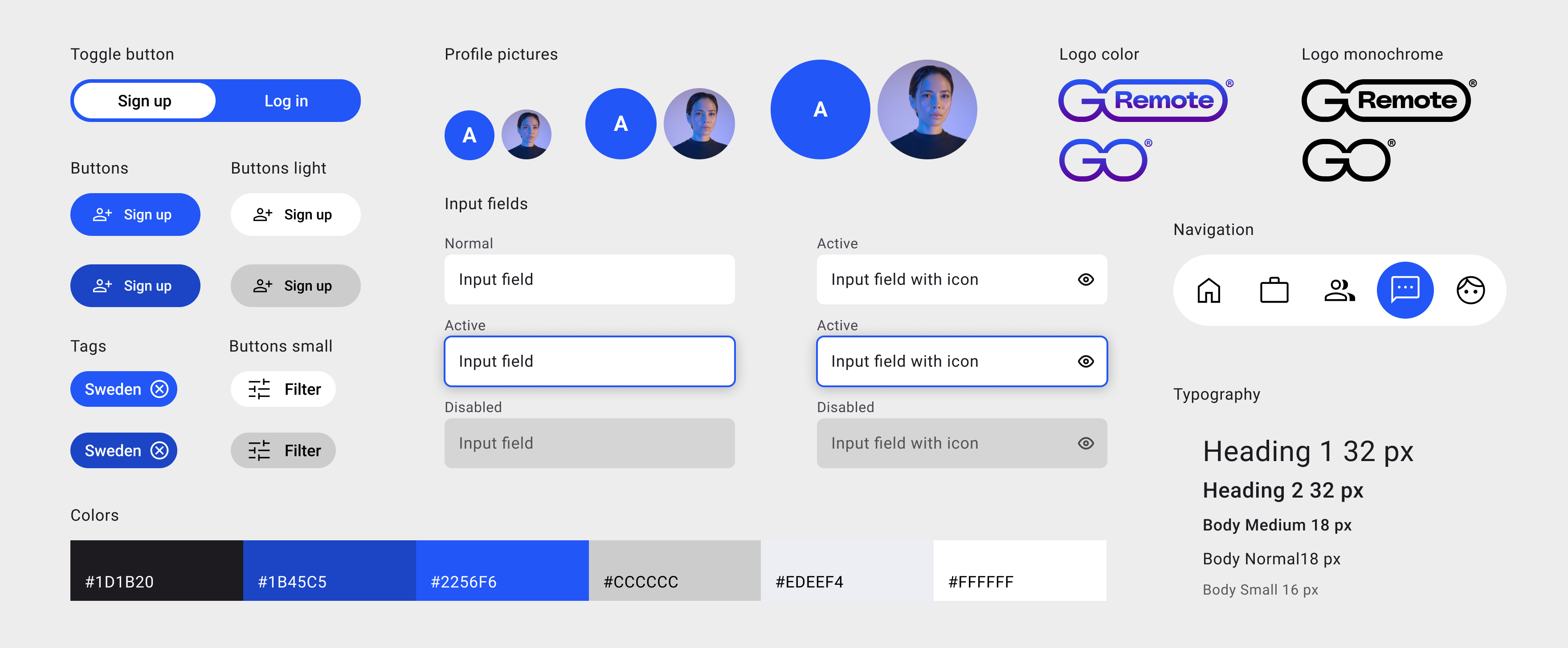
GoRemote Design System
Next steps
Based on findings, it appears that there are areas where the GoRemote app could be improved to provide a better user experience for all types of users. Some specific design improvement concepts that we would suggest exploring include simplifying the search and filtering process, providing clearer and more concise descriptions of listings.
The recommendation would be conducting further research and usability testing to confirm these findings and refine these design concepts. Additionally, the suggesting involving stakeholders and users in the design process to ensure that any changes made align with their needs and preferences.
Through the process of creating a remote job platform, I have learned the importance of putting users at the center of design decisions. Extensive market research helped identify opportunities and stay ahead of the competition. Iterative design and usability testing were crucial in refining the user experience.
